
前面讲了几个css原生的布局属性,都是css传统布局属性。
今天来讲一下目前最主流布局属性:Flex

一、什么是Flex
Flex 是 Flexible Box 的缩写,意为"弹性布局"。
Flex布局的出现是为了弥补float、position等布局属性的不足(比如控制多个子元素的排列方式)。
Flex布局可以很方便地实现目前市面上大部分的视觉设计。
二、Flex语法
display:flex
display: flex; 表示使用flex布局进行排版。display: inline-flex; 表示行内元素的flex布局方式。
设为Flex布局以后,子元素的float、clear和vertical-align属性将失效。
flex-wrap: wrap;
flex-wrap决定子控件是否换行,怎么换行。
.box{
  flex-wrap: nowrap | wrap | wrap-reverse;
}| flex-wrap属性 | 作用 |
|---|---|
nowrap | 不换行,超出部分不显示 |
wrap | 换行,从上往下排列 |
wrap-reverse | 换行,从下往上排列 |
flex-direction: row;
flex-direction决定子控件的排列方向。
.box {
  flex-direction: row | row-reverse | column | column-reverse;
}| flex-direction属性 | 作用 |
|---|---|
row | 主轴水平方向,从左往右 |
row-reverse | 主轴水平方向,从右往左 |
column | 主轴垂直方向,从上往下 |
column-reverse | 主轴垂直方向,从下往上 |
justify-content:center;
justify-content:在主轴方向基础上,子元素水平方向上的排列方式。
.box {
  justify-content: flex-start | flex-end | center | space-between | space-around;
}| justify-content属性 | 作用(在主轴方向基础上水平排列) |
|---|---|
flex-start(默认值) | 从左往右 |
flex-end | 从右往左 |
center | 水平居中 |
space-between | 两端对齐,子元素之间的间距相等 |
space-around | 每个子元素两侧的间距相等 |

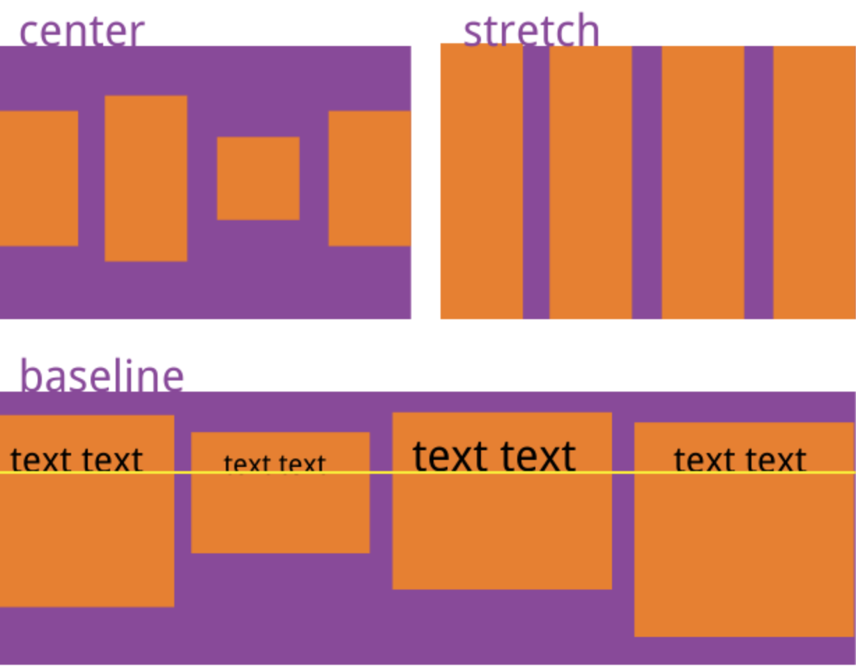
align-items:center;
align-items:在主轴方向基础上,子元素垂直方向上的排列方式。
.box {
  align-items: flex-start | flex-end | center | baseline | stretch;
}| align-items属性 | 作用(在主轴方向基础上垂直排列) |
|---|---|
flex-start | 靠上对齐 |
flex-end | 靠下对齐 |
center | 垂直居中 |
baseline | 项目第一行文字的基线对齐 |
stretch(默认值) | 如果项目未设置高度或设为auto,将占满整个容器的高度 |
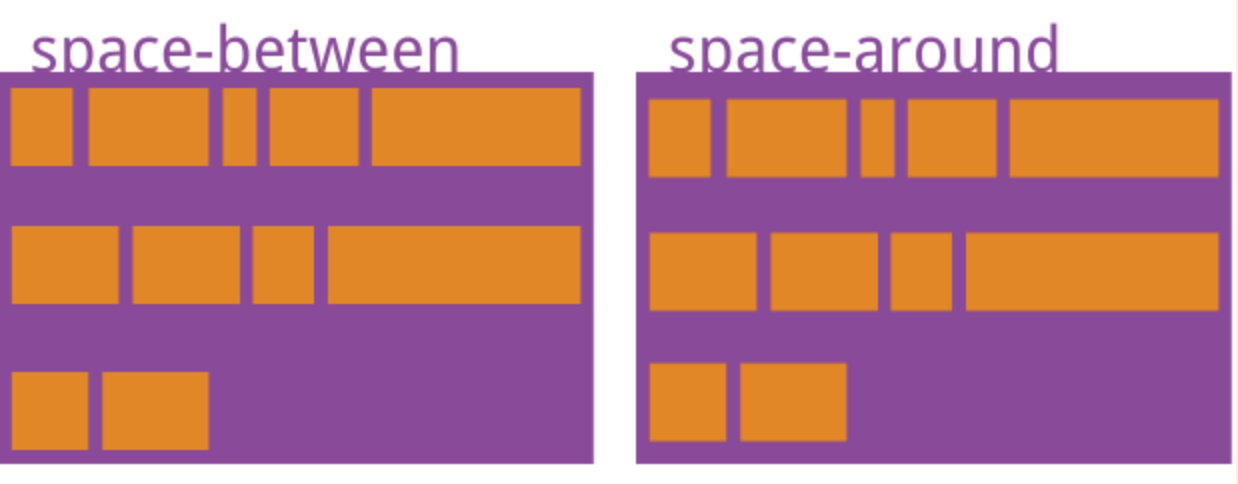
align-content:center;
align-content:定义了多根轴线的对齐方式。如果项目只有一根轴线,该属性不起作用。
轴线可以理解为在justify-content和align-items基础上的子元素排列。
.box {
  align-content: flex-start | flex-end | center | space-between | space-around | stretch;
}可以理解为:在align-items基础上的justify-content
| align-items属性 | 作用(在主轴方向基础上垂直排列) |
|---|---|
flex-start | 靠上对齐 |
flex-end | 靠下对齐 |
center | 垂直居中 |
space-between | 两端对齐,轴线之间的间隔平均分布 |
space-around | 每个轴线两侧的间距相等 |
stretch(默认值) | 轴线占满整个容器高度 |
子元素属性
上面都是针对父布局容器对子元素的排列方式。
子元素也可以决定它在父布局中间的位置,以及与兄弟元素之间的关系。
子元素可以设置的属性如下:
.item {
  order: <integer>;
}

.item {
  flex-grow: <number>; /* default 0 */
}

.item {
  flex-shrink: <number>; /* default 1 */
}

.item {
  flex-basis: <length> | auto; /* default auto */
}

.item {
  flex: none | [ <'flex-grow'> <'flex-shrink'>? || <'flex-basis'> ]
}

.item {
  align-self: auto | flex-start | flex-end | center | baseline | stretch;
}| 子元素属性 | 作用 |
|---|---|
order (默认值:0) | 定义项目的排列顺序。数值越小,排列越靠前 |
flex-grow(默认值:0) | 定义项目的放大比例,如果存在剩余空间,也不放大。 |
flex-shrink(默认值:1) | 定义了项目的缩小比例,如果空间不足,该项目将缩小 |
flex-basis(默认值:auto) | 定义了在分配多余空间之前,项目占据的主轴空间 |
flex(默认值:0 1 auto) | 是flex-grow, flex-shrink 和 flex-basis的简写 |
align-self(默认值:auto) | 允许单个项目有与其他项目不一样的对齐方式,可覆盖align-items属性 |
注意事项
- 如果所有项目的
flex-grow属性都为1,则它们将等分剩余空间(如果有的话) - 如果所有项目的
flex-shrink属性都为1,当空间不足时,都将等比例缩小。如果一个项目的flex-shrink属性为0,其他项目都为1,则空间不足时,前者不缩小。 flex-basis可以设为跟width或height属性一样的值(比如350px),则项目将占据固定空间。
三、Flex兼容性
flex不是所有浏览器都兼容,也不是所有手机都兼容,当遇到兼容问题时,需要用传统的css布局语法进行适配。
安利一个兼容性查询网站:https://caniuse.com/
Flex在各大浏览器的支持情况: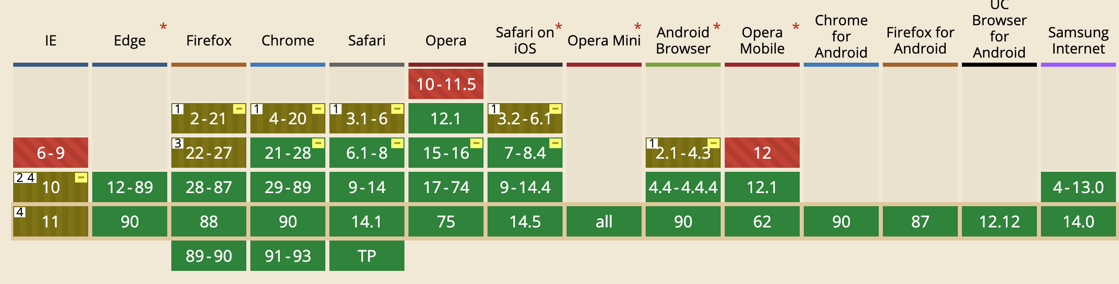
感谢阮一峰老师提供的优质教学文章:
Flex 布局教程:语法篇
Flex 布局教程:实例篇
练习 试一试
<html>
<head>
<style type="text/css">

html, body {
  height: 100%;
}
body {
  display: flex;
  align-items: center;
  justify-content: center;
  vertical-align: center;
  flex-wrap: wrap;
  align-content: center;
  font-family: 'Open Sans', sans-serif;
  background: linear-gradient(top, #222, #333);
}

[class$="face"] {
  margin:16px;
  padding:4px;
  background-color:#e7e7e7;
  width:104px;
  height:104px;
  box-shadow:
    inset 0 5px white,
    inset 0 -5px #bbb,
    inset 5px 0 #d7d7d7,
    inset -5px 0 #d7d7d7;
  border-radius: 10%;
}


.pip {
  display: block;
  width: 24px;
  height: 24px;
  border-radius: 50%;
  margin: 4px;
  background-color: #333;
  box-shadow: inset 0 3px #111, inset 0 -3px #555;
}


.first-face {
  margin: 0 auto;
  height:100px;
  width:100px;
  margin: auto;

  text-align: center;
  line-height:100px;

  display: flex;
  justify-content: center;
  align-items: center;
}
.second-face {
  display: flex;
  justify-content: space-between;
}
.second-face .pip:nth-of-type(2) {
  align-self: flex-end;
}
.third-face {
  display: flex;
  justify-content: space-between;
}
.third-face .pip:nth-of-type(2) {
  align-self: center;
}
.third-face .pip:nth-of-type(3) {
  align-self: flex-end;
}
.fourth-face, .sixth-face {
  display: flex;
  justify-content: space-between;
}
.fourth-face .column, .sixth-face .column {
  display: flex;
  flex-direction: column;
  justify-content: space-between;
}
.fifth-face {
  display: flex;
  justify-content: space-between;
}
.fifth-face .column {
  display: flex;
  flex-direction: column;
  justify-content: space-between;
}

.fifth-face .column:nth-of-type(2) {
  justify-content: center;
}

</style>
</head>
<body>

<div class="first-face">
  <span class="pip"></span>
</div>
<div class="second-face">
  <span class="pip"></span>
  <span class="pip"></span>
</div>
<div class="third-face">
  <span class="pip"></span>
  <span class="pip"></span>
  <span class="pip"></span>
</div>
<div class="fourth-face">
  <div class="column">
    <span class="pip"></span>
    <span class="pip"></span>
  </div>
  <div class="column">
    <span class="pip"></span>
    <span class="pip"></span>
  </div>
</div>
<div class="fifth-face">
  <div class="column">
    <span class="pip"></span>
    <span class="pip"></span>
  </div>
  <div class="column">
    <span class="pip"></span>
  </div>
  <div class="column">
    <span class="pip"></span>
    <span class="pip"></span>
  </div>
</div>
<div class="sixth-face">
  <div class="column">
    <span class="pip"></span>
    <span class="pip"></span>
    <span class="pip"></span>
  </div>
  <div class="column">
    <span class="pip"></span>
    <span class="pip"></span>
    <span class="pip"></span>
</div>
</body>
</html>

暂无评论